Avoid Visual Disasters With These Essential Colors For Matplotlib Best Practices
Creating clear, attractive charts in Python doesn’t have to be a gamble. By mastering a handful of color strategies, you can keep your Matplotlib visualizations from turning into unreadable blobs and ensure they communicate data accurately to every audience.
Start with a Purposeful Palette
The first step is to ask yourself what the plot needs to convey. If you’re highlighting categories, a qualitative palette such as tab10 or Pastel1 offers distinct hues that won’t clash. For sequential data—like temperature gradients or revenue growth—choose a monotonic scale (e.g., viridis or plasma) that moves smoothly from light to dark, preserving the visual ordering of values.
- Qualitative palettes keep categories separate.
- Sequential palettes emphasize magnitude.
- Diverging palettes highlight a midpoint (e.g., profit vs loss) with contrasting colors on either side.
Mind Contrast and Accessibility
Even the prettiest palette fails if viewers can’t differentiate lines or bars. Aim for a minimum contrast ratio of 4.5:1 between foreground and background, which satisfies WCAG AA standards. Matplotlib’s colorblind style or the cividis colormap are designed with color‑deficiency in mind, ensuring red‑green blind users still see meaningful differences.
Testing a plot on a grayscale conversion is a quick way to spot hidden problems—if all elements merge into the same shade, the chosen colors lack sufficient contrast.
Limit the Number of Hue Variables
Overloading a figure with more than eight distinct colors typically reduces readability. Instead of assigning a unique hue to every data series, consider grouping similar series together or using line styles (dashed, dotted) to add visual variety without expanding the palette.
When you must display many categories, use a two‑step approach: first plot with a single hue and varying transparency, then add a legend that maps the hue to broader groups.
Control Saturation and Brightness
Highly saturated colors draw the eye and are perfect for call‑out points, but using them across an entire chart creates visual fatigue. Reserve vivid tones for key data markers—like peak sales or outliers—while keeping the rest of the chart in muted, low‑saturation tones.
Brightness manipulation is especially useful in heatmaps. A light background with darkening cells prevents the “heat map” from becoming a uniform orange sea that obscures fine details.
Leverage Built‑In Styles for Consistency
Matplotlib includes several ready‑made styles (e.g., ggplot, seaborn‑whitegrid, fast) that predefine color cycles, fonts, and line widths. Adopting a style gives your plots a cohesive look and reduces the chance of ad‑hoc color choices that clash. You can also create a custom style sheet that locks in your preferred palette, guaranteeing consistency across a project.
Practical Checklist Before Export
- Verify that every data series is distinguishable by color, line style, or marker.
- Check the contrast ratio with a color‑blind simulator or grayscale test.
- Limit distinct hues to under eight; use patterns for extra differentiation.
- Reserve bright, saturated colors for highlights only.
- Apply a consistent style sheet and review the final figure on multiple devices.
Real‑World Example: Sales Dashboard
Imagine a quarterly sales dashboard showing five product lines. Using the tab10 palette for the lines, you assign the most saturated blue to the total revenue line, while the individual product lines appear in softer tones. A subtle cividis background gradient indicates regional performance, and key outliers—like a sudden spike in product C—are marked with a bold orange star. This combination keeps the overall view clear, highlights important insights, and remains readable for teammates with color‑vision deficiencies.
Takeaway
Avoiding visual disasters in Matplotlib is less about memorizing a long list of colors and more about applying a few disciplined choices: purposeful palettes, adequate contrast, limited hue count, and strategic use of saturation. By integrating these practices into your workflow, you’ll produce charts that not only look good but also convey information accurately—every time.
23 PR Tools For Monitoring & Managing Media Relations In 2021

23 PR Tools for Monitoring & Managing Media Relations in 2021
Best PR Software: Comparison Guide W/ Pricing [2023]
![Best PR Software: Comparison Guide w/ Pricing [2023]](https://prowly.com/magazine/app/uploads/2021/08/PR-software-comparison-Cision-1536x601.png)
Best PR Software: Comparison Guide w/ Pricing [2023]
PR Software | Cision NO
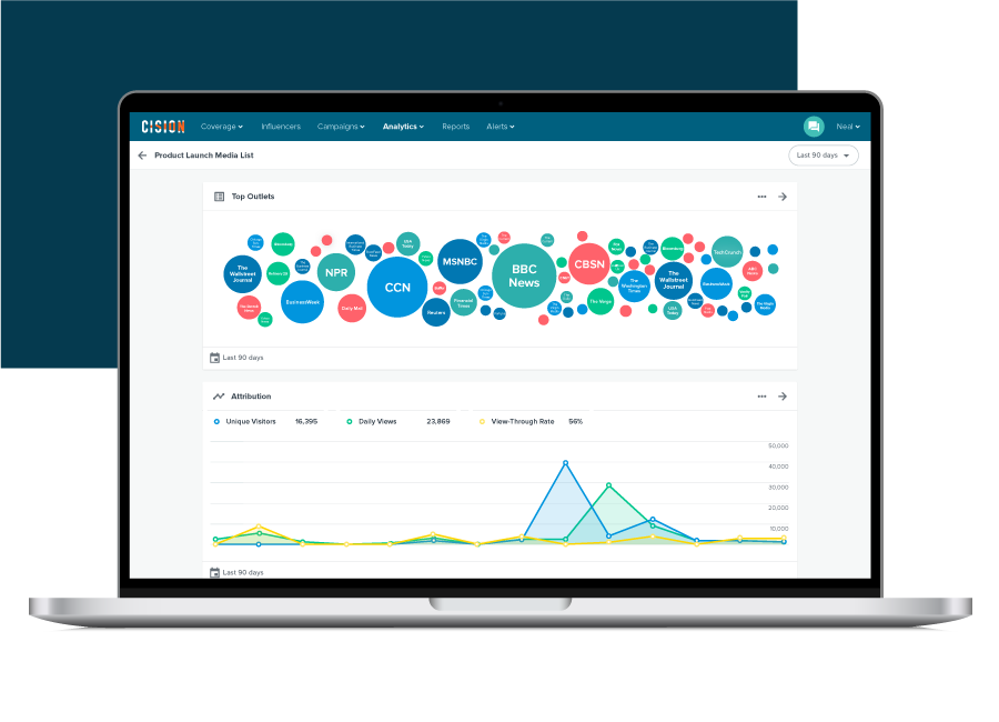
PR Software | Cision NO
PR Software Platform & Marketing Solutions | Cision
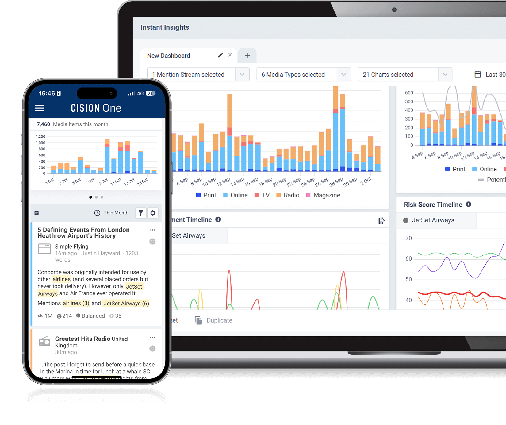
PR Software Platform & Marketing Solutions | Cision
Cision Vs Meltwater PR Platform Comparison
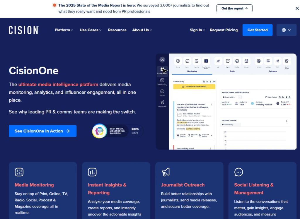
Cision vs Meltwater PR Platform Comparison
Image Gallery: Avoid Visual Disasters With These Essential Colors For Matplotlib Best Practices




Frequently Asked Questions (FAQ)
Q: What is the most accurate information about Avoid Visual Disasters With These Essential Colors For Matplotlib Best Practices?
A: Our platform aggregates the most comprehensive and up-to-date insights, ensuring you get relevant details about Avoid Visual Disasters With These Essential Colors For Matplotlib Best Practices.
Q: Why is Avoid Visual Disasters With These Essential Colors For Matplotlib Best Practices trending right now?
A: Interest in Avoid Visual Disasters With These Essential Colors For Matplotlib Best Practices has surged recently as more people seek reliable resources, related media, and detailed analysis.
Q: Where can I find related media and updates for Avoid Visual Disasters With These Essential Colors For Matplotlib Best Practices?
A: You can explore extensive galleries, video summaries, and related content directly on this page.
